Category Archives: School

Read With Me

Last summer, in hot and furious pursuit of credits to graduate, I took a creative writing class. Instead of being excited for the learning ahead, I just hoped to get through it without ending up in tears trying to finish the assignments. My college memories consist of me hoping this at the start of every semester, often ending up sadly disappointed. This time though, I got darn lucky.

Mr. Baxter, the creative writing professor, turned out to be one of my all time favorite teachers. I liked him because he was young enough to remember how hard college is for those foolish enough to endure it. He understood we all had other homework and other commitments in addition to his course. Instead of taking these situations personally, he accepted them and asked for no justifications. He honestly couldn’t have cared less about the excuses. All he cared about was writing and literature. I hate that expression about someone’s “passion” for their work. It’s so often used to describe people not deserving of the title. But for this professor, it applies in spades.

As we made our way through the semester, he led discussions about the stories we read with infectious zeal. His intensity and focus on writing styles, sentence structure and phrasing completely changed the way I read and interpret writing.

In the final week of the class, Mr. Baxter offered to create a reading list for anyone interested. I jumped at the chance and when I met with him to retrieve my final paper, he presented me with a two-page list of books. The selections are a mix of titles specifically tailored to my tastes (stories set in the 1940s!) and classics everyone should read. Each title is accompanied by a note, justifying it’s position on the list.

Long story short, I’ve only made it through one of the books on the list as yet, so I will be discussing each one as I finish it here. Anyone who would like to jump in and read one of the books along with me is most welcome. I’ll post the intro to each new book every other Saturday morning, allowing two weeks for reading in between.

The list:

The Slaves of Solitude, Patrick Hamilton

Mrs. Bridge, Evan S. Connell

Blithe Spirit, Noel Coward

The Quick and the Dead, Joy Williams

The Rainbow, D.H. Lawrence

The Group, Mary McCarthy

Brideshead Revisited, Evelyn Waugh

The Remains of the Day, Kazou Ishiguro

Jude the Obscure, Thomas Hardy

Consider the Lobster & A Supposedly Funny Thing I’ll Never Do Again, David Foster Wallace

The plays of Martin McDonagh

The Thin Place, Kathryn Davis

The Short Stories of Shirley Jackson

Slaughterhouse Five, Galapagos & Breakfast of Champions, Kurt Vonnegut

The Sea, John Banville

“The Dead” from Dubliners, James Joyce

The Portrait of a Lady, Henry James

Bleak House, Charles Dickens

All right then. My post on The Slaves of Solitude will be up on Wednesday, July 27th. In the meantime, if you’d like to read along, inexpensive copies of the book can be found here. Don’t let that odd cover art fool you, either. The Slaves of Solitude has nothing to do with houses of ill repute.

Check out my Amazon aStore with all the books on the list here. There’s also a link for it in my menu at the top of the page.

7 Comments

Filed under Book Review, My Art, School

New art!

Hello friends! I’m woefully behind in answering your lovely comments, but I promise, I will soon. In the meantime, would you like to have a guess as to the subject of my latest portrait? This is my first caricature, rendered in vectors (infinitely scalable graphics to you) and created entirely in Adobe Illustrator CS5.

So, who is this? Extra bonus points for additional information about the character, if you know it.

5 Comments

Filed under Film Bloggers, My Art, School

The Noir Girl Uniform

The *Official* Noir Girl Uniform

Silhoutte

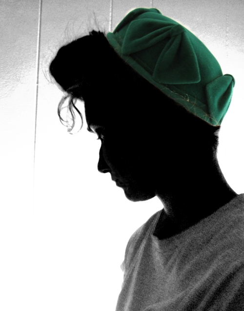
I wore an outfit very similar to this today at school. I created it just so I could wear the precious green wool hat from my avatar photo. It was terribly exciting garb to spend my day in, so much so I’ve decided to make it my official uniform. If I ever get to meet any of you lovely dears in person, this is how you’ll know me! I’ll be the girl in the bright green hat, lost in her own world of wardrobe satisfaction.

6 Comments

Filed under Fashion Backward, Noir, Pick-me-ups, School

The Floating Head Syndrome

Recently I’ve been designing a movie poster for my Graphic Design class and part of the learning experience is finding out what not to do. Our professor showed us this very informative short about how movie posters are made in the big leagues: aka, Hollywood. I offer it for your viewing pleasure.

Movie Poster Floating Heads from Funny or Die —> Click to watch

[I’m very sorry about the link. I tried to embed it, but WordPress doesn’t like the embed link for some reason.]

Okay, so honestly, I’ve never realized this before! I guess I don’t pay enough attention to modern Hollywood. *cough, cough*

The other component of our lectures in preparation for the movie poster assignment was several Powerpoints of Polish film posters. The Poles are world renown for their eclectic designs of film posters. They famously misrepresent (or at least it seems that way to us) the films they are depicting. According to my prof, the reason for this misrepresentation is that the posters were made by artists who had not yet seen the film. They were creating the posters to be used as promotional material for underground theaters in Communist Poland (Poland was communist from 1945-1989). So, when they were designing, they had a limited little verbal sketch of what this film was about. Most likely provided by a shady character who was smuggling in bootleg copies of the films. (Sounds rather like film itself, doesn’t it?)

My friend Lolita is coincidentally doing a superb series showcasing these Polish posters, so I refer you to her amazing posts – Freaky Film Posters or: Do They Feel All Right In Poland? (part 1) (part 2)

Casablanca PolishBrief Encounter Polish

These two are my favorites of the ones Lolita shared. Obviously the first is Casablanca (1942).  Lolita is right that it would be a stronger piece without the speech bubble. If you cover up the bubble with your hand, you can see how the poster is way more powerful. I think the person who designed this poster really had seen Casablanca before designing it. You can’t get that close to the storyline without at least one viewing.

The second poster is a bit of a puzzle at first glance. Look carefully. The strange abstract tower-like object is actually a train signal. Then we have darkness, a bright spot in the corner and a silhouetted couple in the foreground. Any guesses so far? Yup, it’s none other than Brief Encounter (1945)!

Here they are side by side with the Hollywood originals. How do think the Poles stack up?

Brief Encounter PolishBrief Encounter

Brief Encounter, Polish and American. Notice the floating head syndrome on the left in the American poster. I do love the illustration style of the American one, though!

Casablanca PolishCasablanca

Casablanca, Polish and American. Boy us Americans are really plagued with this floating head thing!

**You know, all the time I’ve been writing this post the text at the top of that Polish Casablanca poster has been reminding me of something. I just figured out what it is. Check out this cover from a Manhattan Transfer CD:

manhattan transferVery similar, no? I wonder who this artist was inspired by?

Well, that’s all for now folks. But stay tuned for a peek at the poster I designed from all this inspiration!

4 Comments

Filed under Film Bloggers, My Art, School

Elizabeth’s Two Sisters Tag

Hello dear friends! It’s seems ages since I wrote a blog post! But, never fear – I haven’t dropped off the face of the earth. ;) And I haven’t lost interest in blogging, either. (I have so many ideas for posts I think I’m stuck with blogging for a good 6 more years!) I’ve simply entered back into service for my coveted degree, often times feeling like my head will explode with ideas, deadlines and lists of supplies I must buy or bring to class. (Don’t tell my profs, but I shouldn’t even be writing this now – I’ve got several projects I should be working on! Shhhh!)

Anyhow, my lovely friend Kate has kindly tagged me to participate in Elizabeth’s Two Sisters Tag. Here goes:

  1. Do you like Greta Garbo? In general, like will I watch anything she’s in just because she’s in it? No, probably not. Even though actresses with accents are a huge favorite of mine, something about GG rubs me the wrong way. Must say though, before I get too much fruit thrown at me, I totally love Ninotchka. She’s brilliant in the comedic scenes- especially the one where Melvyn Douglas pops the cork on the champagne bottle and she falls to the ground blindfolded as if she’s been shot. I burst out laughing every single time I watch that.
  2. In Buster Keaton’s MGM films, do his gestures and his plots resemble those of Harry Langdon? Elizabeth will be very disappointed in me when I say I have never seen a Harry Langdon film. But! Don’t feel too bad yet, Elizabeth because I did my homework and looked up Harry on Youtube. I see what you mean about his style and how it is choppy and staccato. I also watched a clip from The Cameraman (made by Buster Keaton at MGM) and I do see a resemblance in the physical styles. I think it’s highly believable Buster was channeling (subsciously or otherwise) Harry for his MGM films. We’re all inspired by everything around us all the time, so why couldn’t Buster be inspired too?
  3. Who is your favorite director of silent dramas? Fritz Lang – just for Metropolis.
  4. Do Harold Lloyd’s movies (movies, not shorts) drag along? Absolutely, positively not! Harold is my favorite of all the slient era comedians. He’s so sweet and kind. And I never felt his chase scenes dragged on. My favorite HL film is The Cat’s Paw. The last scene where he tricks all the bad guys with the magic secrets is totally priceless. I’m always spellbound during that scene. I love seeing the bad guys get their due!
  5. Who made better silent shorts, Mack Sennett or Hal Roach? Hal Roach, no doubts at all.
  6. Is Al St. John a genuine heavy, or a baby heavy? (This is based on the idea of the “Baby Vamp”, which was the character of the girl who was vampish, but not a vamp.) Although I have never seen Al St. John in a film, I say genuine heavy. Elizabeth says “heavy” means the villain, and in this case, I think it fits. Al St. John was rather handsome (in some of his early photos I found, he was quite good looking). A good villain should always have some appeal of some sort – he’s all the more dangerous for it! (by the way is St. John pronounced as it looks or in the English fashion: “sinjin”?)
  7. Do you like 1920s musicals? In theory, yes. Sadly, I’ve seen very few. Just don’t have Joan Crawford dancing and we’ll be fine. ;)
  8. Do you like Al Jolson’s movies? No, no, no – a thousand times NO! Al Jolson is one of those people I simply cannot stand. In particular, his voice and conceited attitude grate on me to no end. I’ve seen The Jazz Singer and have a very hard time seeing why everyone holds him as a fine example of a classic film star. It looks like I agree with Elizabeth’s sister and Kate’s mom on this one.
  9. Who is your favorite animal star? This is an incredibly tough one! And not because there are so many animals I love, but because I’m trying not to copy everyone else! First, I’ll just say I’m not a big fan of either Lassie or Toto. I hate crying over Lassie and worrying she’s going to die every 5 seconds and Toto was just not cute enough to be given such a major role. Asta from the Thin Man films would have been my first choice for this honor, but since I’m trying to be original here I’m going with choice #2: Bonzo from Bedtime for Bonzo with Ronald Reagan. I’ve talked about this film before, trumpeting the fact that it is an amazingly good film despite all the ridiculous bad press it has received. Besides dear Ronnie, Bonzo is one of the major reasons why it works. He’s adorable! I had no idea I could love a chimpanzee so much. Monkeys are usually not my cup of tea.

So! Many thanks to Kate for tagging me and Elizabeth for creating such a twister of a tag. :) You made me work hard for these answers, and now I’m just a little bit smarter about silent films, so thank you very much for that, too!

If you have a couple minutes you really should click through the links above and read the other responses to the tag. They’re marvelous! Happy day, my dears and I hope to have a new post for you soon!

11 Comments

Filed under Film Bloggers, Pick-me-ups, School, Tags & Awards

My Art: Handmade Boxes

Over the past month-and-a-half, I’ve been taking one of the most exciting studio classes of my college career so far: Bookmaking. We did indeed learn to actually sew books. Although, today I’m going to spotlight the equally thrilling paste-paper covered boxes we made at the same time.

Above you can see the fruits of my labor in all their glory. Allow me to explain them to you. Each piece starts with a cardboard under skeleton. I measured and cut all the cardboard for everything you see here. The cardboard used is a special kind with a denser quality than regular corrugated cardboard. (If you’re interested in exactly what kind of board I used, click here.)

Starting in the bottom left hand corner of the photo, the stack of green and yellow covered prisms are bookweights. “Bookweight” is a gloriously fancy term for a cardboard box filled with 4 rolls of pennies and covered with a lid. They are remarkably useful for holding pieces together while waiting for glue to dry. The escapade of obtaining those pennies was hilarious. You’d be surprised how hard is actually is to get your hands on $8 worth of pennies in rolls. You’d think they were solid gold the way no one wants to give them up. I went on a hunt for them with two other girls from my class and at one of the banks we visited, the teller informed us she wasn’t allowed to give away that many rolls of pennies without her manager’s permission. Since he was on the phone and we were late for class, we decided to just leave empty handed with nothing but tired, exasperated faces for our trouble. Wal-Mart was the friendliest place we found in our search, but they would not exchange pennies for all of us, because they understandably needed to keep some for the registers. The banks had no excuse, though. In the end, I collected half of my needed pennies from my brother’s change box and my own penny collection. The rest were a gift from Wal-Mart. Anyway….

Moving clockwise in the photograph, we next come to the deep red clamshell box. It is exactly the same kind of box as the black and green one in the foreground. I found the clamshell boxes to be difficult to get right, so that is why I’ve made two. :) A little practice never hurt anyone! The clamshells are meant to be protective cases for special books. I haven’t finished the matching books yet, but they are in the works. The book for the red case is going to have oyster colored resume paper for the interior pages. (I found an old box of it in my stash, so it’s rather like recycling!) Here’s an inside view of the red clamshell.

Up next are the Japanese boxes. These are crafted in a special way. Each side piece is laid end to end on the pastepaper and covered. The button and string are sewn on next. Then the box gets folded up and the right and left sides are covered and glued in separately. Getting those final sides just right is tricky, so I’ve made four of these to make sure I could master it. :) Here are some closeups of the Japanese Boxes:

The large blue and yellow Japanese box is a 5 sided box and has two lids. It looks so neat when opened:

The final collection of boxes in the top photo are basic lidded containers. They are covered in paste paper inside and out. These are constructed completely different than the Japanese boxes. The cardboard skeleton is assembled first, 4 sides and bottom all glued together in box shape. Then, it gets covered in paper through a series of intricate snips and cuts. They are still easier than the Japanese boxes, though!

As for the pastepaper, it started life as regular sketchbook paper from those large drawing pads (if you’re an artist, you probably still have one of those Strathmore pads around somewhere!). By applying a mixture of acrylic paint and gel painting medium, the paper becomes something special. The designs are created by swirling afro picks, combs, plastic forks and plastic milk jug templates through the wet paint. The dual color effect is achieved by painting the paper a single color first and allowing it to dry before creating the design over it in a contrasting color.

So, I hope this is some kind of explanation for my absence of late. It is tremendous fun, and I foresee myself making books and boxes for eternity! And if you enjoyed this peek into the art in my life, remember to stay tuned for the handmade book unveiling. :D

12 Comments

Filed under My Art, School

Spiffy

Greetings, friends! I feel like I’ve been away on some long trip, when really I’ve been here all the time, working through my summer. I’m awfully sorry for my inexcusable absence (how’s that for a contradiction in terms!). I’m taking two summer classes right now and the work load is pretty demanding. But, all is going well and I’m having a blast in my bookmaking class. I’ll be posting photos of my projects from that soon.

spiffy shot

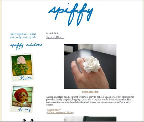
Anyway – my reason for breaking into your life this fine day is to share some exciting news with you. I’ve recently become the new co-editor of Spiffy, a lovely blog dedicated to all things neat, smart, chic and stylish started by my friend Kate Gabrielle of Silents and Talkies and Flapper Doodle fame. I’ve written two posts so far, showcasing some amazing artwork and jewelry. Please stop by over there and take a peek. There is a never-before-seen-on-this-internet shot of me when I was about 3 years old in the sidebar just below Kate’s shot from the same time. We look like we were at the same party, we’re dressed so alike!

So, I hope you are all enjoying the summer (or fall/winter – depending on which hemisphere you’re in)! I’ll be back soon, I promise. I can’t bear staying away for long. I go through “blog-withdrawal” only to be cured by writing a new post. :)

5 Comments

Filed under Pick-me-ups, School

My Art: Cupcakes!

This is the other piece that was accepted into my school’s Student Show.  It’s a wonderful feeling to walk into the gallery and see my piece hanging there.  It’s like seeing your name on a marquee or your face on a billboard – thrilling and kind of scary at the same time.  Anyway, this piece is officially called Flowing, but I think it’s much more fun to call it Cupcakes!  It was born out of an assignment that required me to use 1,000 objects to create a piece of abstract art.  One of the unshakable rules was that it could not be representational.  Annoying at the time, but in hindsight, I’m glad for that restriction because I think it made me think more creatively.  So, this is what I came up with.  1,000 cupcake papers strung on thin wires and then inserted into a floral foam sphere.  The sphere is located at the very top, allowing the cupcake sprays to freely cascade down.  When the breeze hits it, the delicate papers make the most amazing sound – something like soothing wind chimes, but more interesting.  I love the way it sounds. :)

6 Comments

Filed under My Art, School

My Art: Jackie’s Catalog

For the final project in my Layout and Design Class, we had to design a 16 page catalog.  We could choose any products we wanted to showcase, but preferably something we had easy access to.  I wanted to pick items that had personal meaning for me, but would be easy to get images from.  I decided on the collection of classic children’s books we have from when me and my brother were little.  It was a fantastic opportunity to revisit childhood memories and use some of the books I love so much for a project.  I am beaming with pride about this project now, because it is currently on display in my school’s art gallery in the Juried Student Show.  I entered three pieces and two were accepted into the show (you’ll see the other piece tomorrow).  It’s a great honor to get pieces accepted into the show, because the judging is tough.  Well, have a look and see if you agree with the judges.

From the beginning, I wanted to use the jacks as the connective element to tie all the pages together.  I also wanted to integrate it into the logo as the dots for the letters.  I was trying to come up with a catchy name until I finally realized how neat it would be to just call the catalog Jackie’s. The jacks in the logo were originally yellow (to match the jacks inside) but it was too hard to read from a distance. So, with some tweaking the logo became what you see now. I think it’s one of the best logos I’ve made so far.

Just one last shot to prove it really is in the show.  I gave them copies of all the spreads, but the Corduroy one is the only one they chose to display.

8 Comments

Filed under My Art, School

Candyland in France!

Hello, friends!

I’m working on an architecture project right now, comparing The Palace of Versailles (in France) with The Imperial Villa Katsura (in Japan).  It’s interesting for me, but amazingly time consuming.  I’m not going to have time to write a proper post, like I wish I could.  So, rather than just be silent, I thought I’d show you this darling photo I found while researching for my project.

It’s a farmhouse on Marie-Antoinette’s private estate which is part of the Palace of Versailles.  The first thing I thought when I saw it was “Candyland!”  Can’t you just see Mr. Mint coming down that spiral staircase?  Or Gramma Nut tending the garden?  The top circle window looks exactly like a peppermint. :)

Anyway, I wish you all a most relaxing rest of your weekend!  And, don’t forget, there’s still time to enter the giveaway. I’m drawing the winners on Wednesday.  I’m so excited with all the responses.  Thanks to everyone for the fabulous comments!

4 Comments

Filed under Pick-me-ups, School